Brief
Pretend you work at a design agency and pitch a brand of your choice: the client has heard 3D is the next big thing on the web and wants an animated promotional header for their website. It didn’t have to be photorealistic, but it couldn’t be static.
The project ran in milestones: a style board, sketches and references, a blockout, and finally a desktop hero (1920 × 1080) and a mobile version, rendered with and without the website UI.
Concept project for a school assignment, not made for or with Disney.
Process
Picking a brand
I started with five brands in mind: McDonald’s, Netflix, Apple, Chanel and Disney. The moment I heard the assignment I was already picturing a composition for each, but for Disney I could see the castle straight away, and I knew that one would turn out best visually. I was a bit worried it would feel too obvious, since most people picked more specific brands.
I sketched a composition with possible animations for my top three: Disney, Netflix and McDonald’s. In the consults I was told to go for either Disney or Netflix, and that McDonald’s was too obvious. When I asked why Disney wasn’t, my teacher said most people are afraid of doing Disney because of copyright, or because they think they need the actual characters. For me that was a challenge accepted.
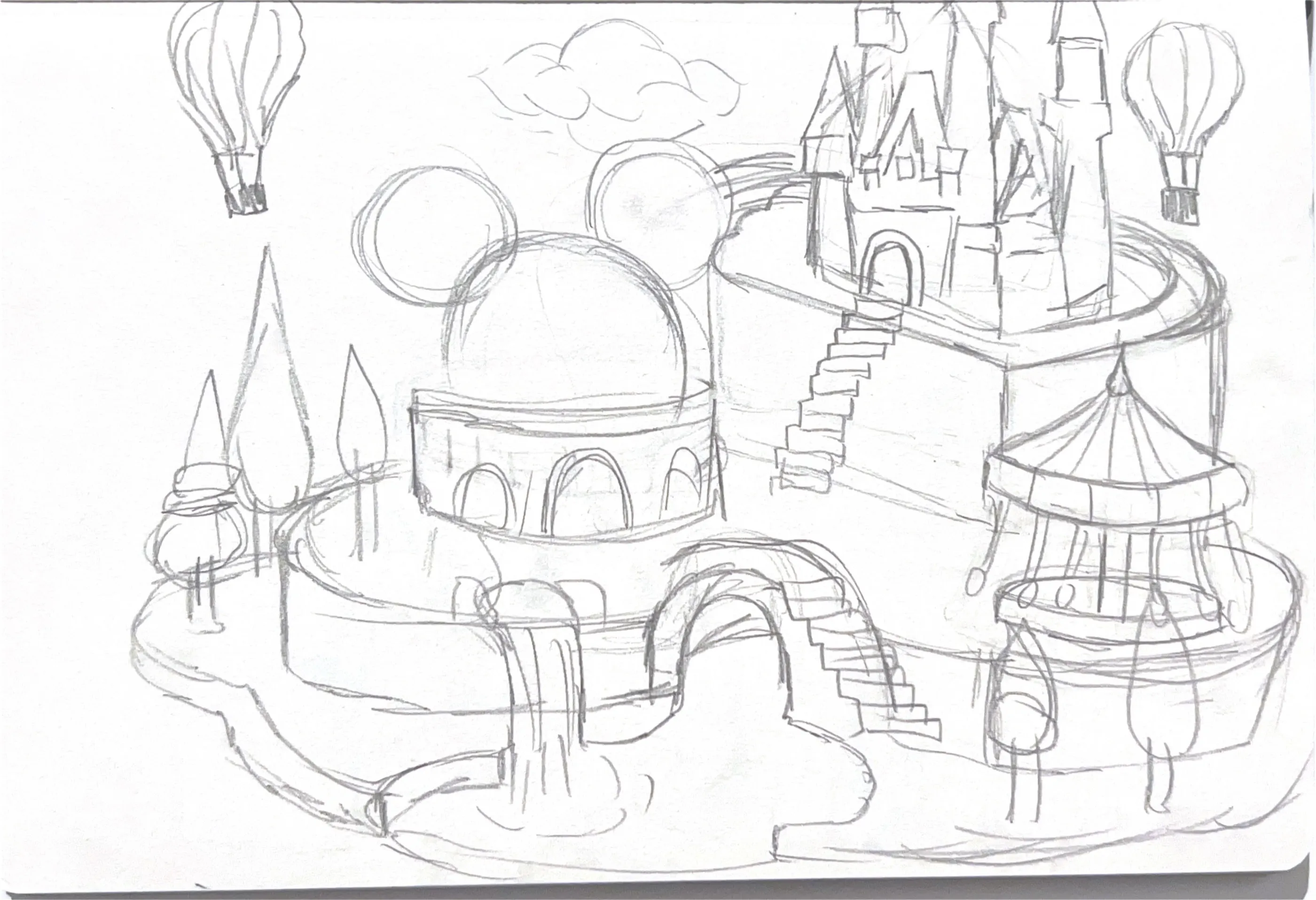
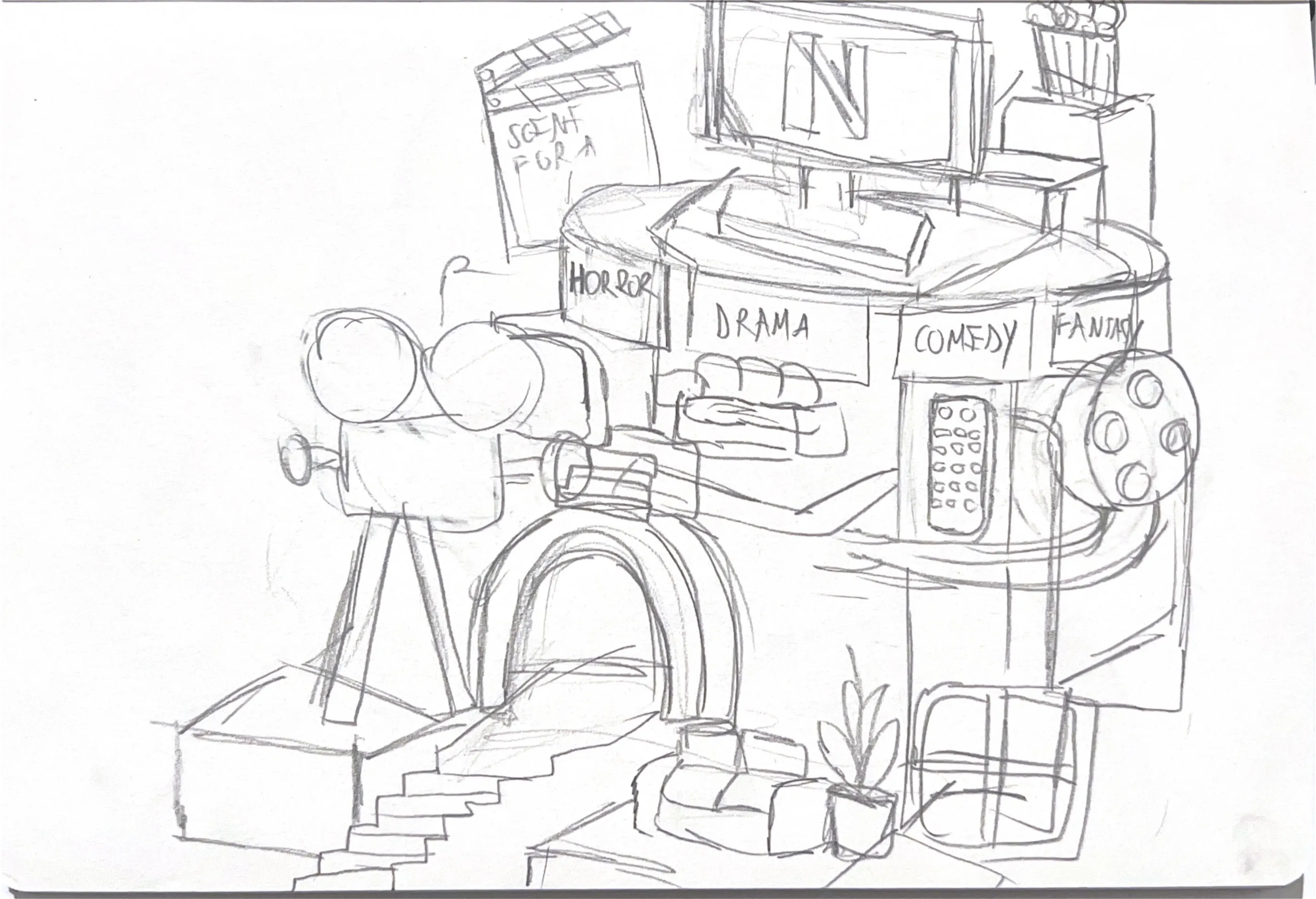
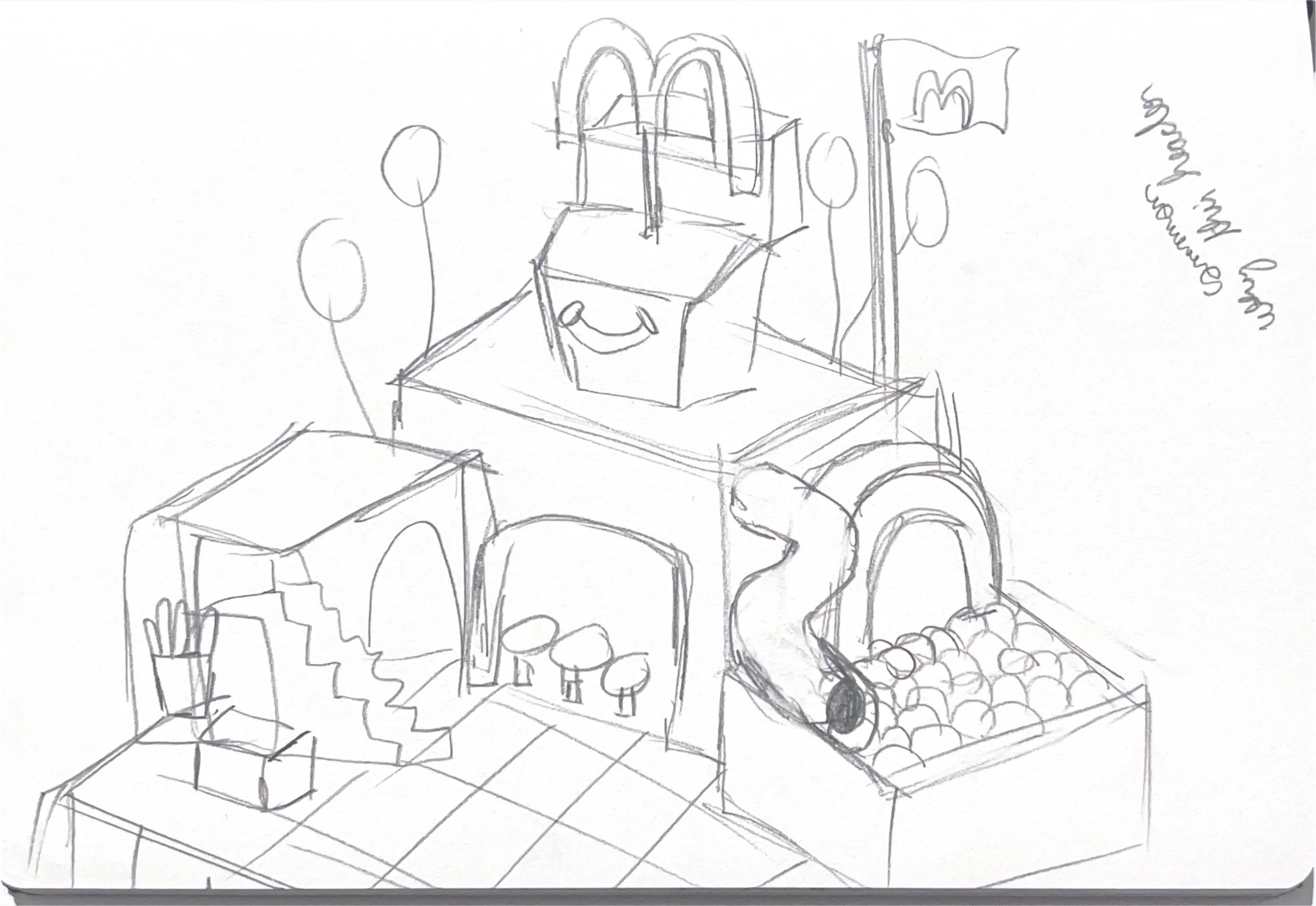
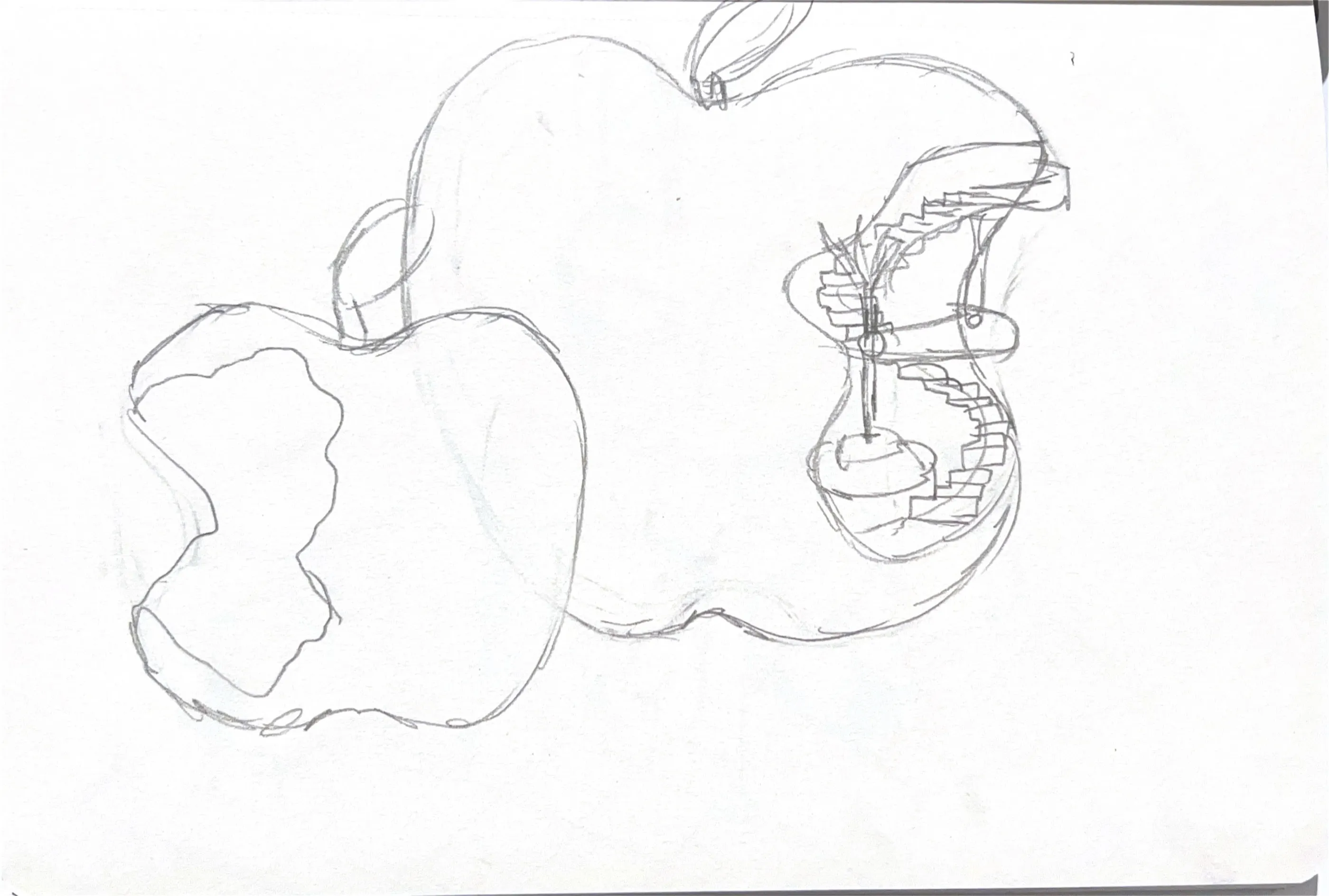
First sketches: Disney (theme park), Netflix, McDonald's and Apple.
I dropped Netflix: it was a free choice, and I knew I didn’t have the same passion for it, so I wouldn’t do as good a job.
Finding the angle
Both concepts were approved, but I needed an angle. My first Disney sketch was basically a theme park. Looking at what everyone else was making, much more abstract and unreal compositions, I decided to change it. I brainstormed for a few hours and landed on a mix of theme park and storytelling: fairytales coming alive at night. The new sketch was approved again.
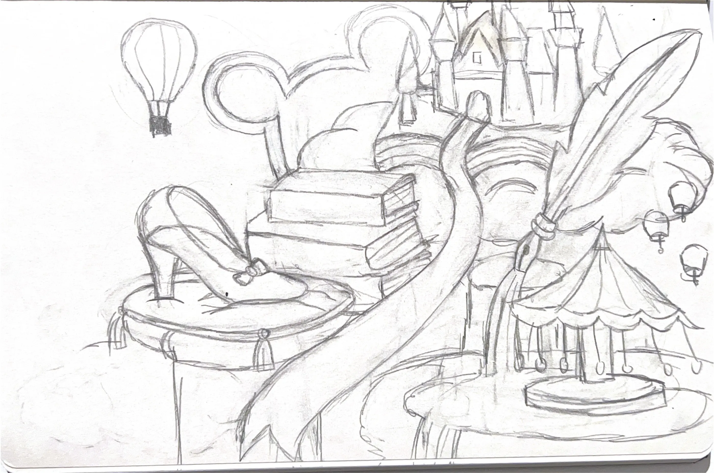
The new sketch: fairytales coming alive at night.
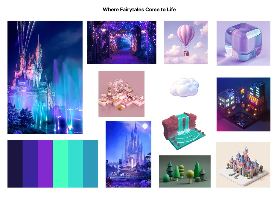
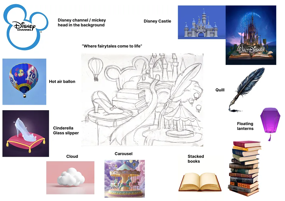
Style board and references. Click to enlarge.
I was warned that some elements would be hard to pull off, like the glass slipper, and I already knew the lighting would be tricky because everything happens at night.
Building it
I started with the blockout like everyone else, but I tried to make the castle as close to the final one as possible so I wouldn’t have to change much later. After that I built every object one by one. The glass slipper alone took me a full day to get the shape I wanted.
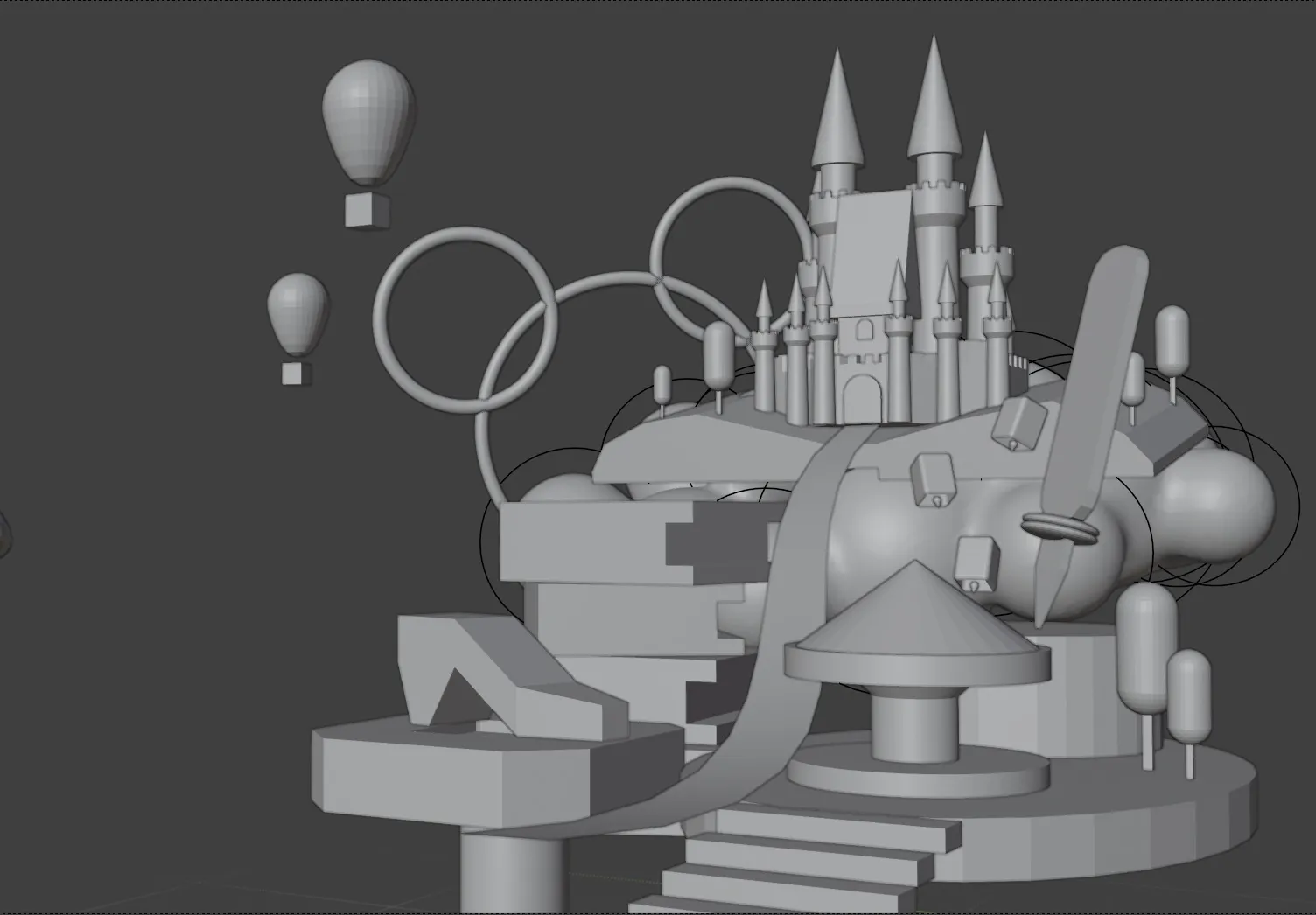
The blockout. I kept the castle close to its final shape from the start.
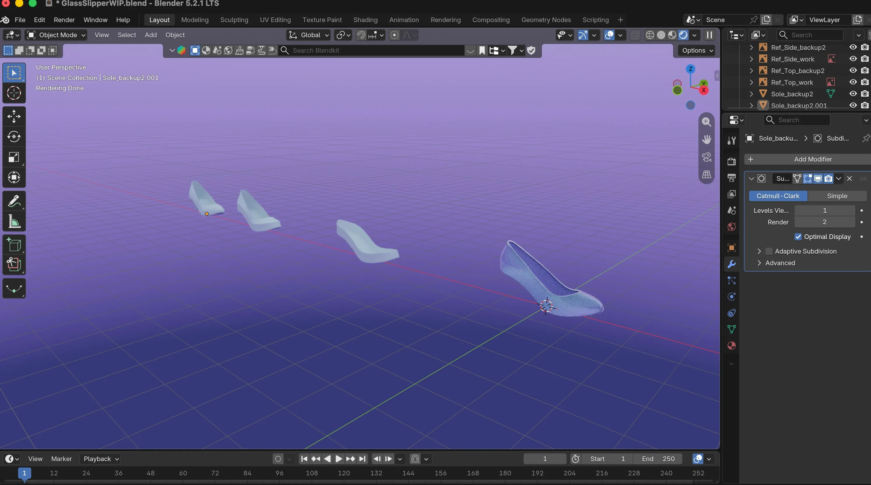
The glass slipper in Blender, with earlier versions of the shape behind the final one.
Learning Blender while doing this wasn’t easy, but it came naturally to me, and what kept me going was that I genuinely enjoyed what I was making. Funny enough, the mobile version ended up being the biggest struggle.
Result
Desktop render without the website UI.
The mobile version, with and without UI, recomposed for a tall screen.
My teacher asked me:
“Do you have prior 3D knowledge?”
I didn’t. I had never heard a teacher be this proud of my work, and that made me really happy.
Gallery
-
Desktop hero, with UI
-
Desktop hero, no UI
-
Mobile hero, with UI
-
Mobile hero, no UI