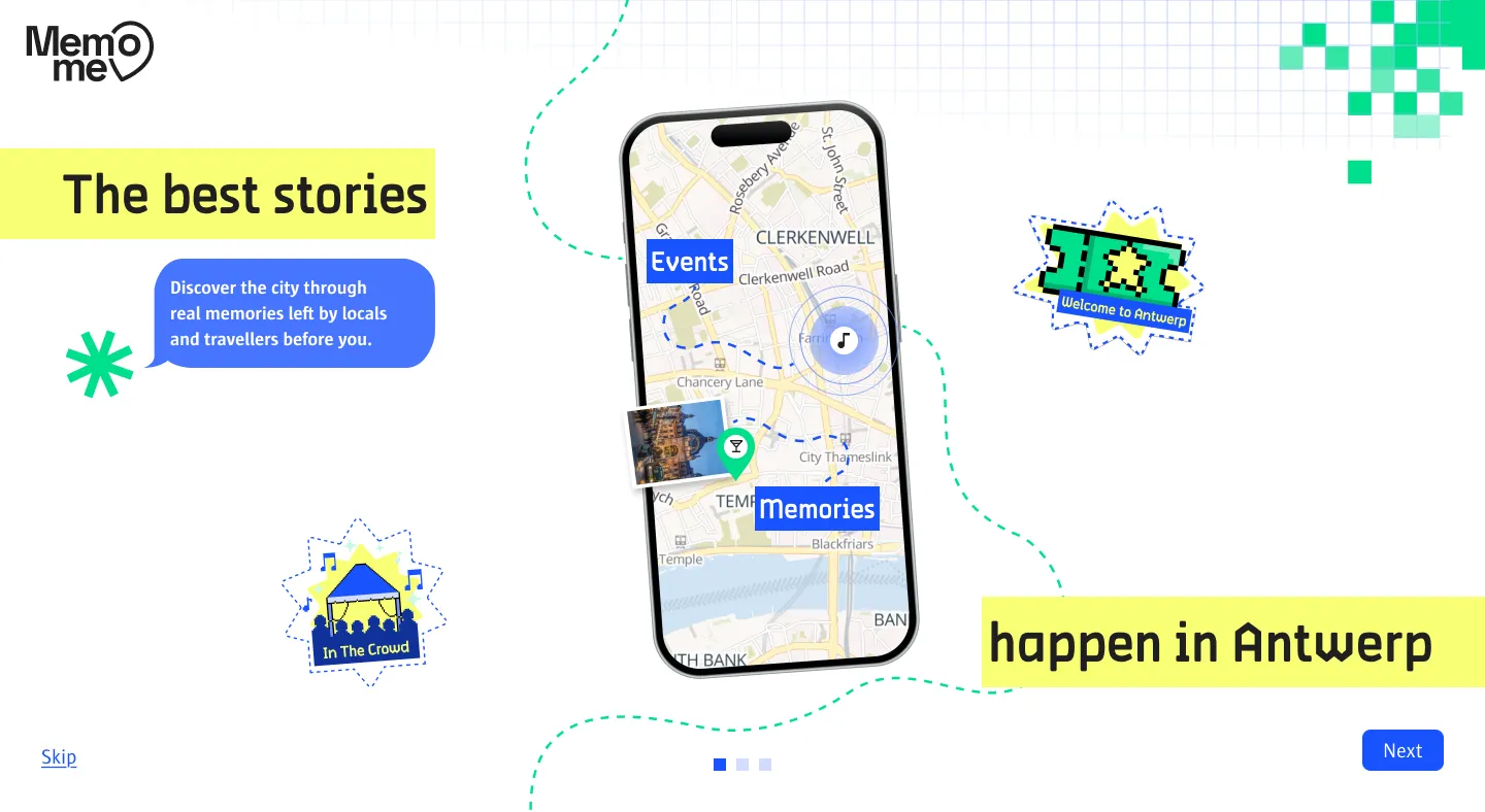
Brief
Our client was Visit Antwerp. They wanted young travellers, roughly 18 to 36, to come to Antwerp for more than a day. The catch: that group ignores typical tourism ads and doesn’t believe much of what official accounts post. Our idea had to start online, feel real, and connect an app with a campaign in the streets or on social media. On top of that, the style had to follow Visit Antwerp’s brand guidelines without looking like one of those official ads.
We were four. Until the concept was ready, everyone did everything together; once we started making the app, we each took our own departments. Mine were UX research, visual design and branding, marketing materials and motion. The app was built in React, with Strapi and Vercel, but the coding wasn’t my part.
Process
Research and concept
All four of us went out and interviewed 21 young travellers on the streets of Antwerp. The answers kept coming back to the same two things: they go by what friends and the people they meet recommend, and what they remember afterwards are small moments rather than the big sights. Together we turned that into personas and a customer journey, and used MoSCoW to decide which features the app really needed. So MemoMe is built around memories: a map of the city where locals and visitors pin their own stories, and where you can save places, collect stickers and add a memory yourself.
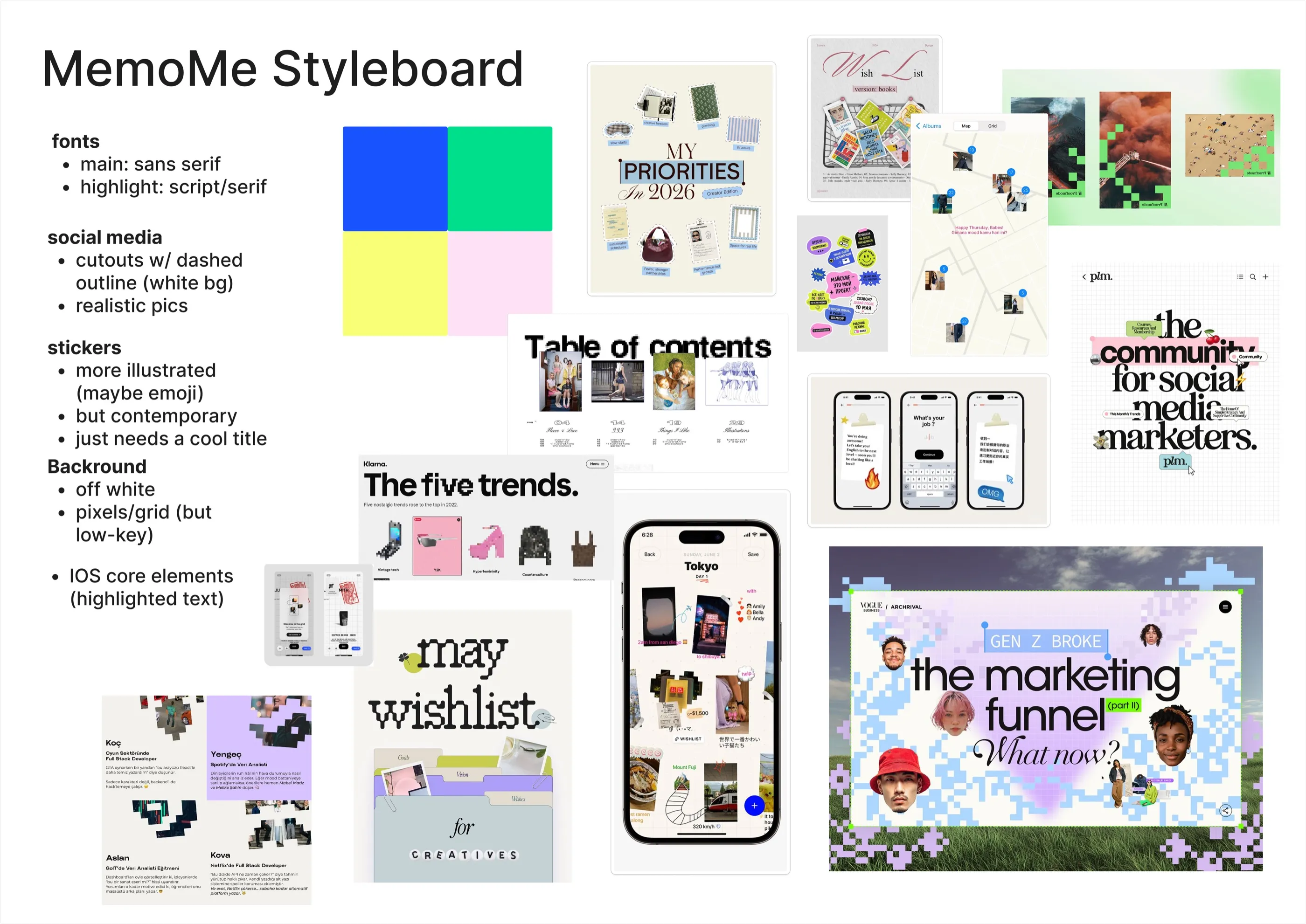
The style board we made as a team, within Visit Antwerp's brand guidelines.
The user journey
I drew the storyboard for the user journey, from someone finding MemoMe on TikTok to the trip journal they end up with.
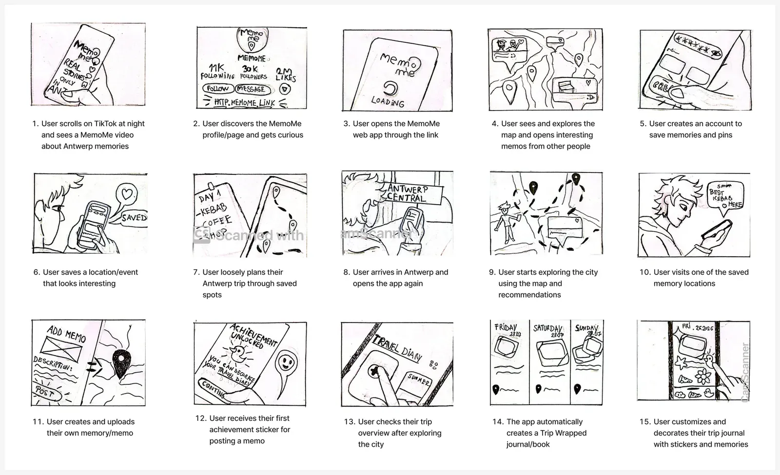
The user journey, from a TikTok video to a decorated trip journal.
The design the app was built on
Three of us had a day to design pages of the app in the style we had agreed on. I made five screens, a profile, settings and the travel diaries, trying out different colours and layouts. The team decided to continue with the style of my settings page and my second travel diaries for the rest of the app, with a bigger title and a white arrow button.
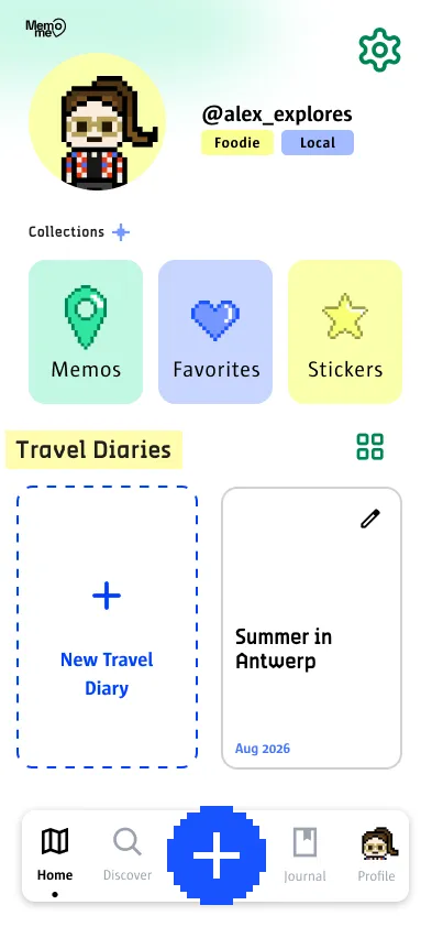
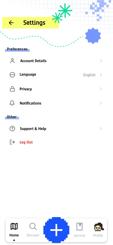
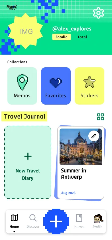
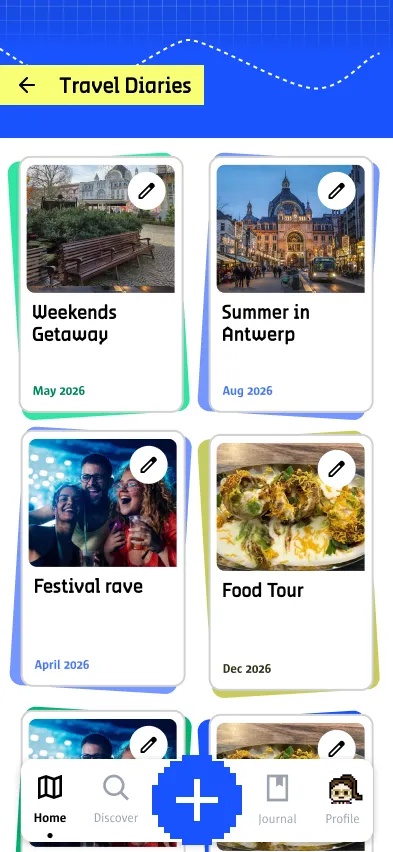
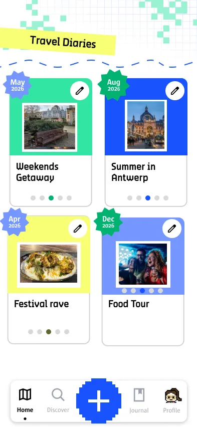
My first five screens. The style of the second (settings) and the fifth (travel diaries) was used for the rest of the app.
Stickers
MemoMe has two kinds of stickers. The physical ones have a QR code and are placed around the city for people to scan. We designed those together, and I came up with some of the first ideas and the funnier ones.
I was tasked with the whole set of achievement stickers you earn in the app. They’re meant for decorating your trip journal, and since the journal already says MemoMe, the stickers didn’t need to. So I kept them general and nice to look at, without pushing the brand, so you’d still want to stick them on your stuff even if you don’t like wearing fully branded things. I made them in Figma and Pixilart, a pixel-art website. They were also printed, to hand out to our teachers.
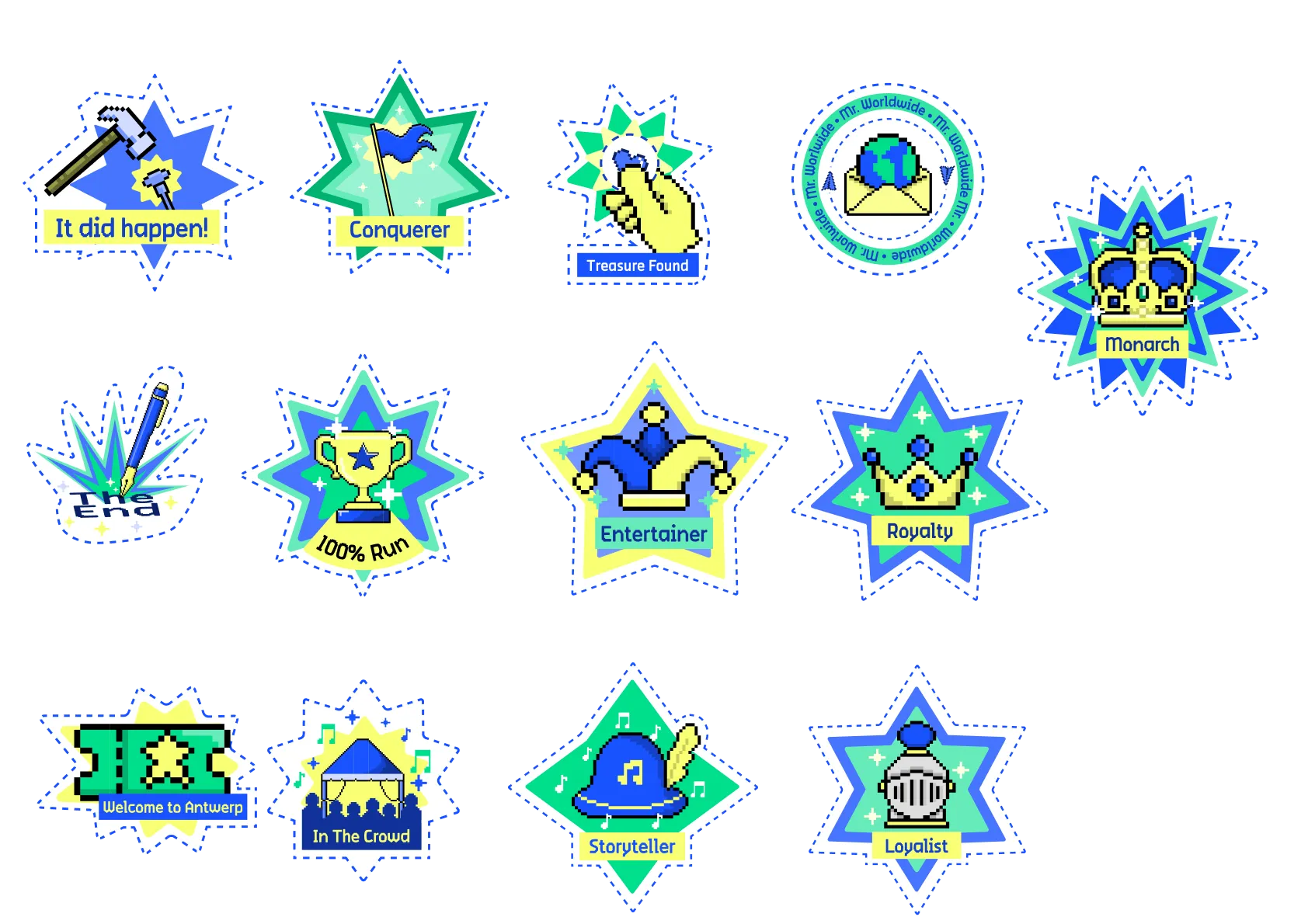
The achievement stickers I designed for the app.
Posters
I made the posters for the campaign, designed simply to grab people’s attention.
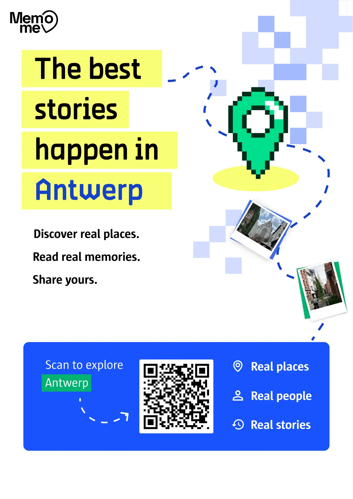
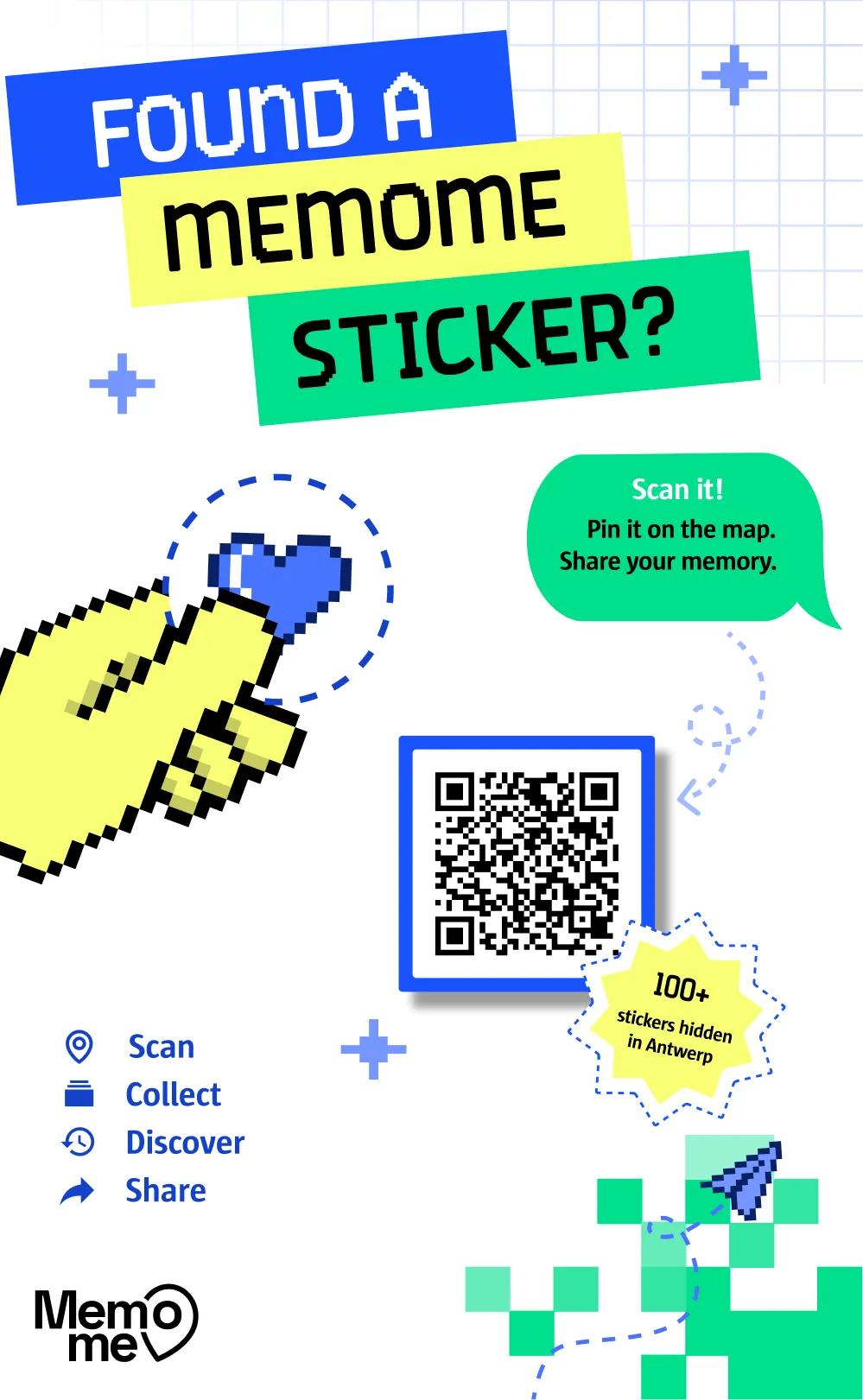
The two campaign posters.
Result
We were also asked to make a case movie, a promo video for the final jury. Irina Moldovan and I made it together: my part runs from 0:00 to 0:48, and I tried to keep it playful.
The case movie. 0:00–0:48 by me, the rest by Irina Moldovan.
The finished app is live, so you can try it yourself.
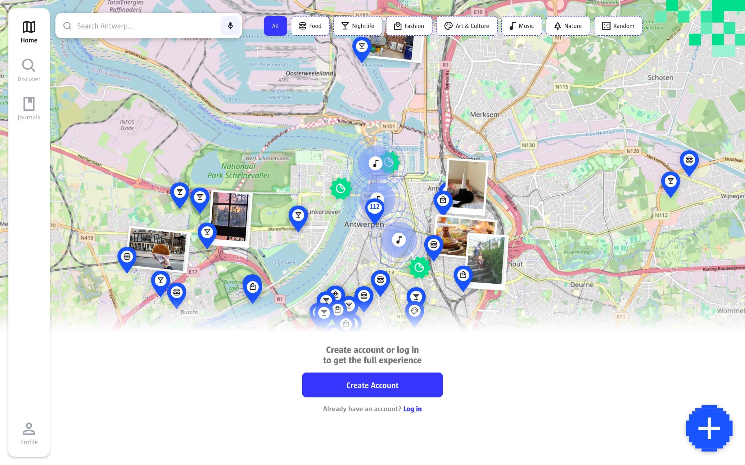
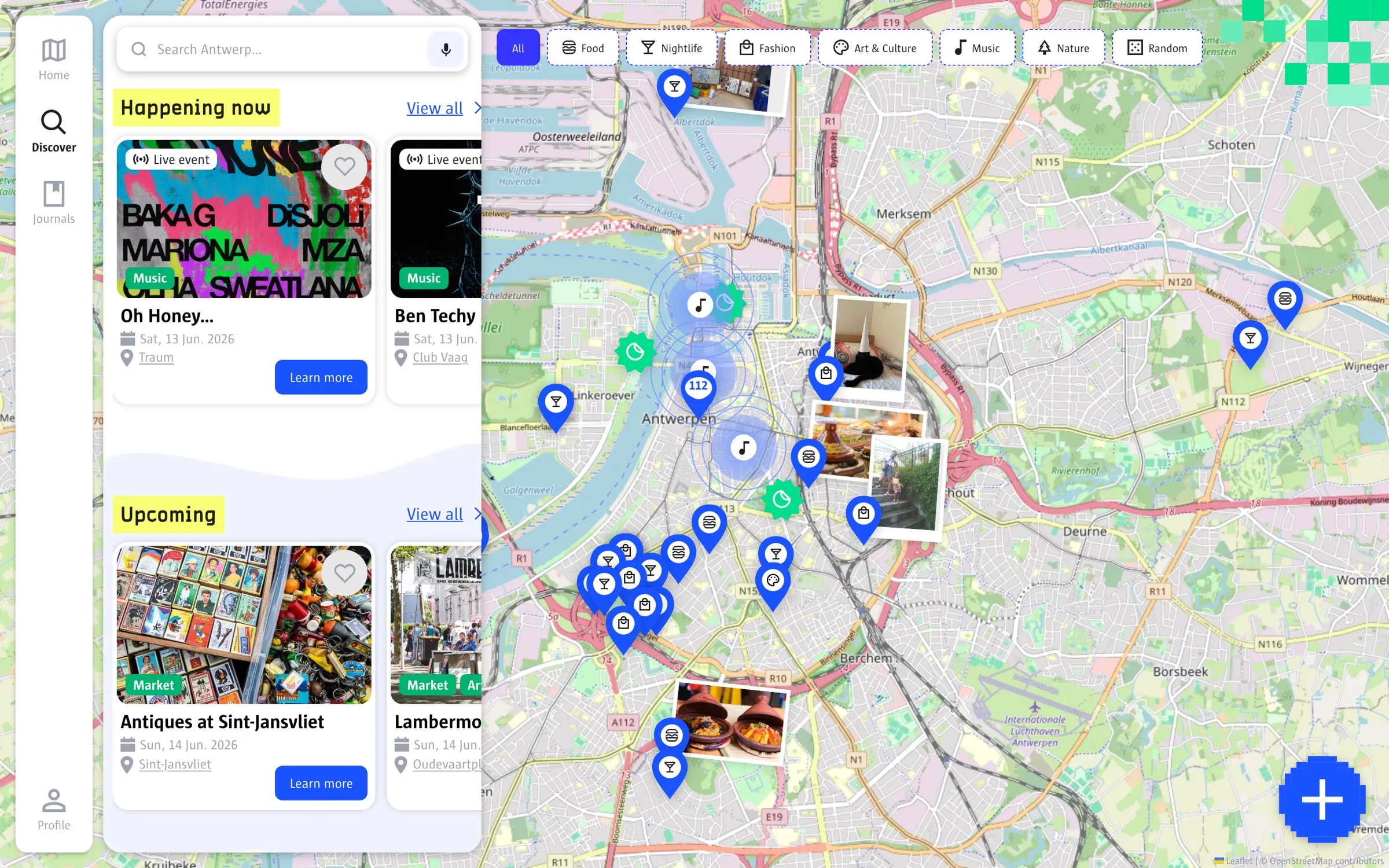
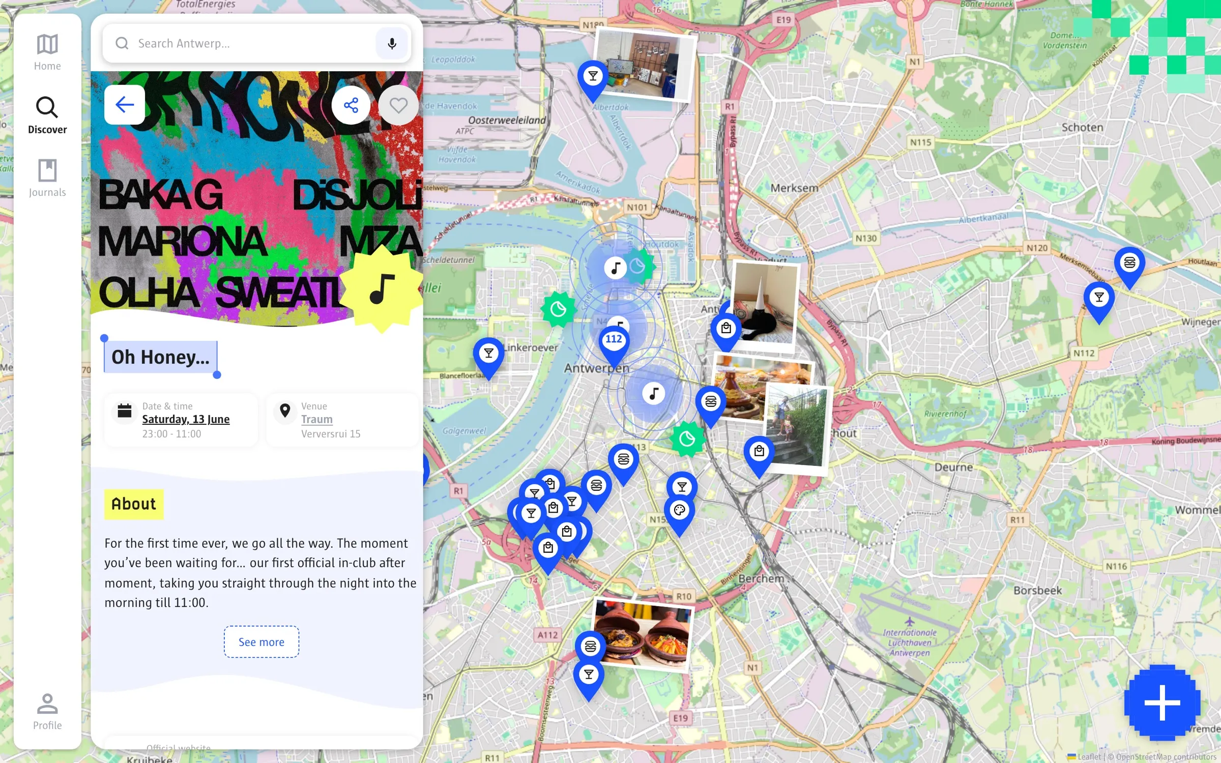
The map, Discover and an event page on desktop.
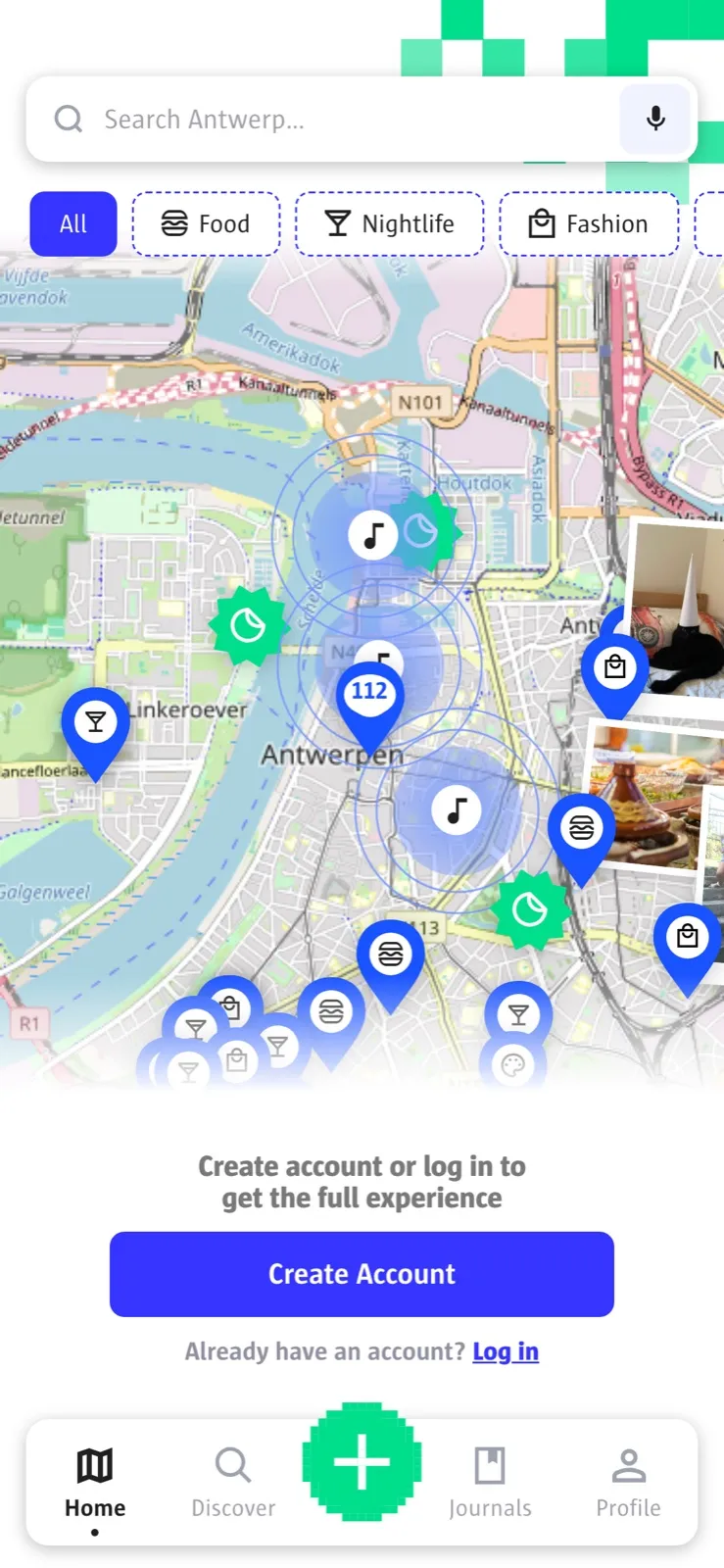
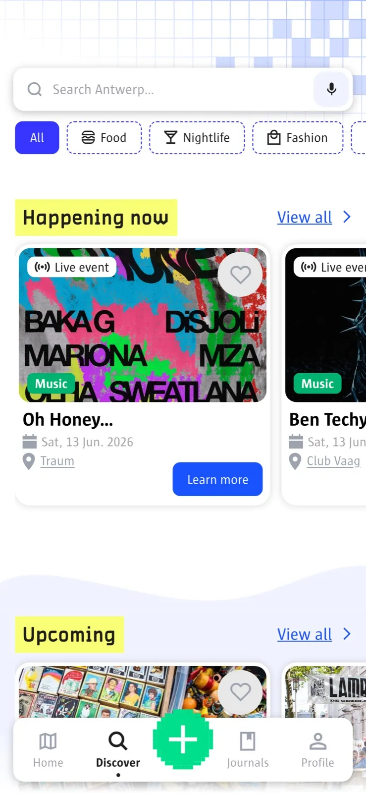
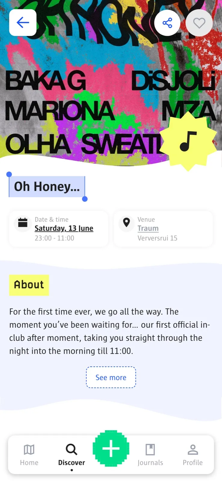
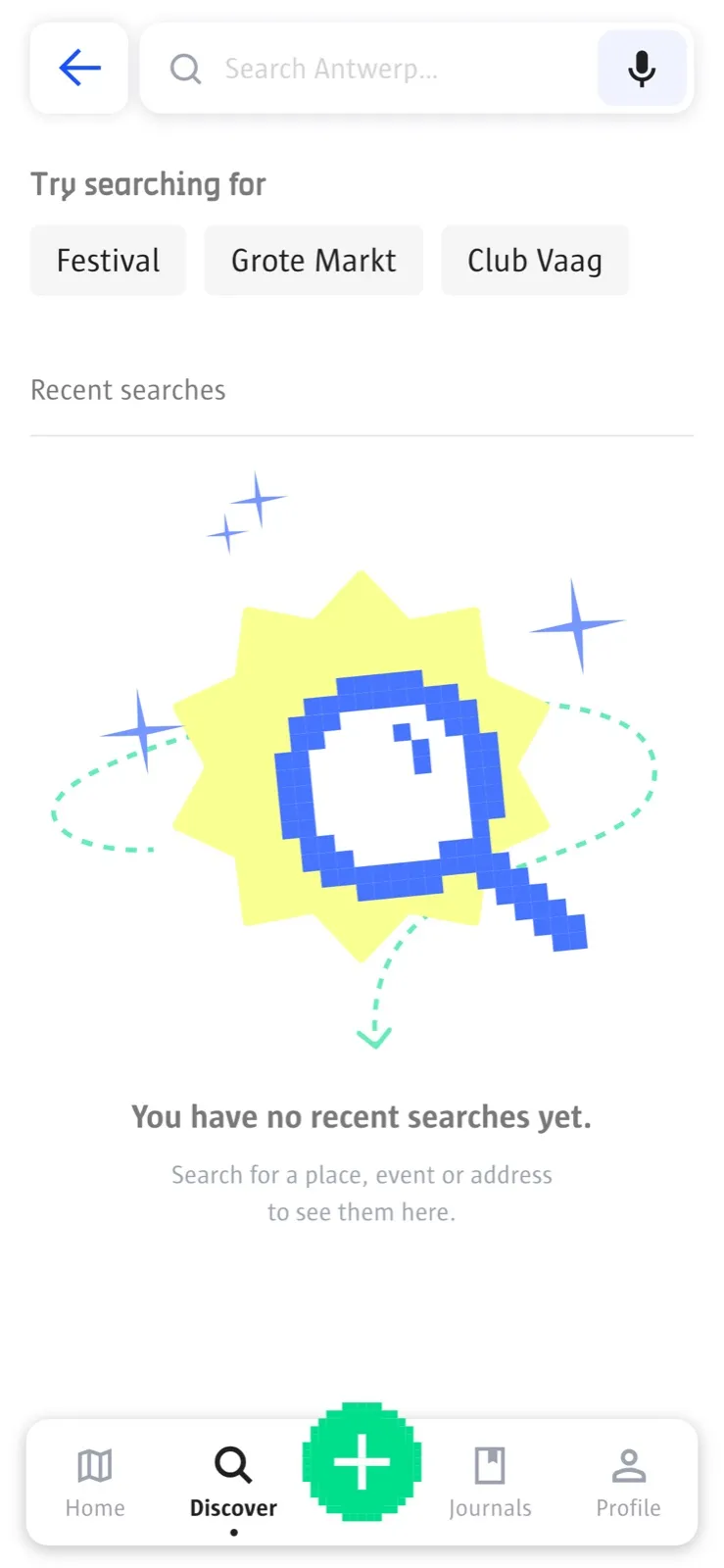
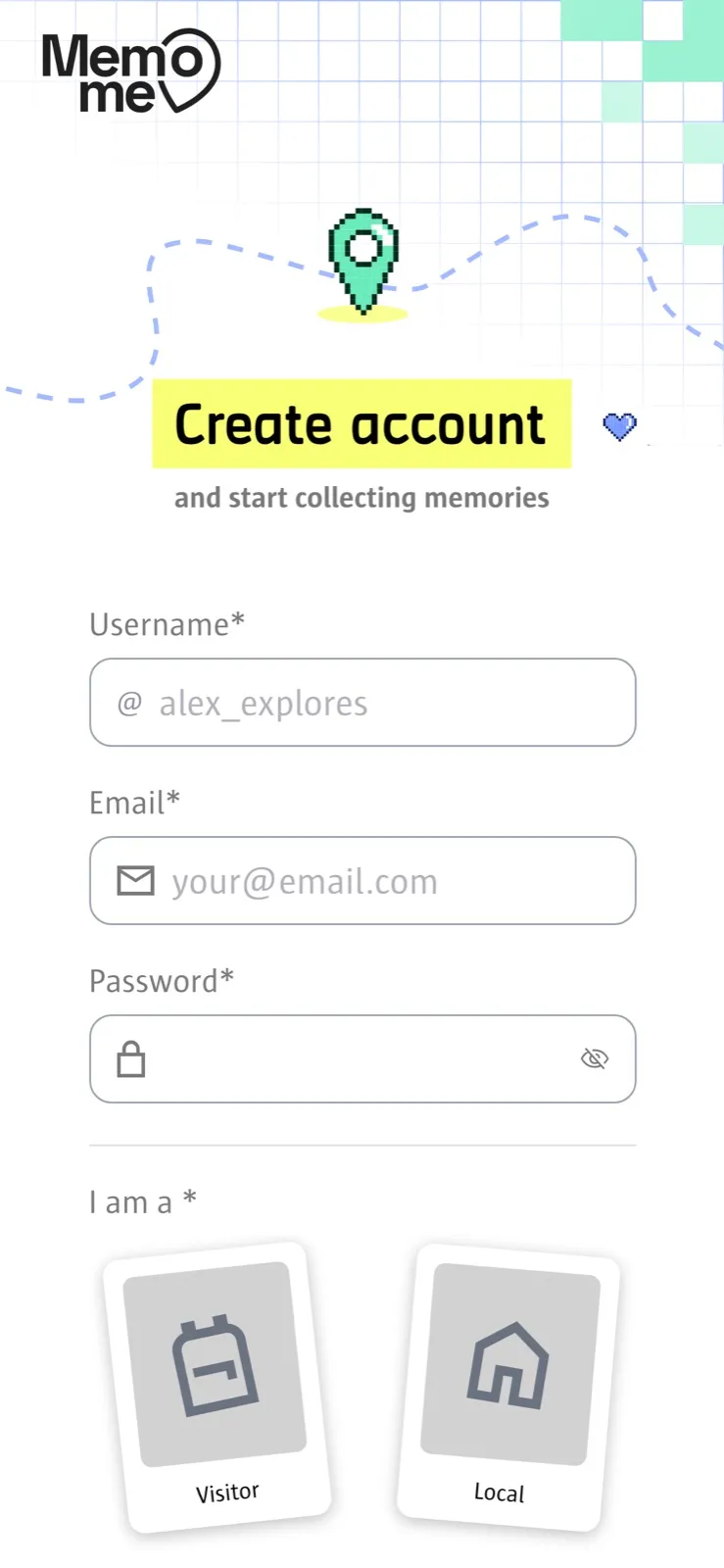
The same app on a phone.